Excel has a very handy feature that does linear regression for you very intuitively.
Let’s say you have a data set like this:
| x | 9.42 | 2.78 | 5.87 | 5.49 | 6.48 | 4.91 | 7.82 | 2.70 | 2.65 | 8.42 | 5.85 | 0.93 |
| y | 52.24 | 4.15 | 13.72 | 7.00 | 5.28 | 6.98 | 42.00 | 7.15 | 3.41 | 31.00 | 12.59 | 1.09 |
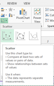
First, you’ll have to insert a scatter chart:
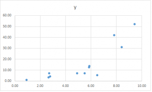
You’ll get a chart like this (Excel is smart enough to figure out what should be the x-axis and what should be the y-axis):
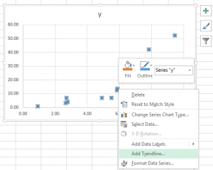
Now, right click on the dots and then you can select “Add Trendline…” from the pop-up menu.
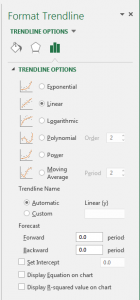
Then you’ll be presented with a dialog like this:
Note that Excel has different options for “Linear” and “Polynomial”. Here the option is about the relationship between the variables. All these different options are all Linear Regressions.
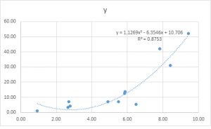
Let’s try a order 2 polynomial regression and check the option “Display Equation on chart” and “Display R-squared value on chart”. This is what you’ll get:
Good thing about doing this in Excel is, you can always change the data set and your chart and equation will be updated automatically.
Depending on the nature of your data set, you may want to try different model to get a better fit, the procedure will be the same.
